Styles
Custom Webchat Example
This example allows you to create custom elements for Webchat. All custom components are stored in src/webchat.
src/webchat/index.js
export const webchat = {

  // Webchat styling
  theme: {},

  // Webchat features
  persistentMenu: [],
  blockInputs: [],
  enableEmojiPicker: {true|false},
  enableUserInput: {true|false},
  enableAttachments: {true|false},
  enableAnimations: {true|false},
  visibility: {true|false|'dynamic'|() => Boolean()},
  coverComponent: React.Component,

  // Webchat listeners
  onInit: app => {},
  onOpen: app => {},
  onClose: app => {},
  onMessage: app => {}
}
This Webchat example allows definitions that enable you to configure the example.
| Property | Description | |
|---|---|---|
theme | Define your webchat styles | |
persistentMenu | A persistent menu can be accessed from a small button in the input text box. It allows the user to access popular functionalities anywhere in the conversation | |
blockInputs | Enables you to define which user input is forbidden. It is useful to prevent the user from entering a credit card number. | |
enableEmojiPicker | Enables the emoji picker. It can also be defined in theme.userInput.enableEmojiPicker. Default value: false. | |
enableAttachments | Authorizes user media attachments or not (true or false). It can also be defined in theme.userInput.attachments.enable. Default value: false. | |
enableUserInput | Enables the user typing zone (true or false). It can also be defined in theme.userInput.enable. Default value:true. | |
enableAnimations | Enables webchat animations (true or false). Default value:true. It can also be defined in theme.animations.enable. | |
visibility | To make webchat visible or not. If you want to use the settings defined in Hubtype Desk, you must set this value to 'dynamic'. You can pass a boolean true to make it visible or false to make it invisible, or you can define a function returning a boolean resolving the visibility. | |
coverComponent | A React.Component shown the first time a user interacts with the Webchat. | |
onInit | This event is triggered once the webchat is loaded in the webpage. | |
onOpen | This event is triggered once the webchat has been opened. | |
onClose | This event is triggered once the webchat has been closed. | |
onMessage | This event is triggered once a message is sent by the enduser or the bot. |
Note: Listeners are useful to react to some events when using the webchat.
Custom Styles
Here is a list of available styles. You need to modify them inside src/webchat/index.js's theme object:
| Property | Description |
|---|---|
mobileBreakpoint | Width (in pixels) for mobile responsive design. Set to 460 pixels by default |
style | The main characteristics of webchat such as size, background color, etc. |
webviewStyle | The main characteristics of your webviews such as size, background color, etc. It can also be defined in webview.style. |
webviewHeaderStyle | Styles for the webview header. It can also be defined in webview.header.style. |
triggerButtonImage | Launcher icon to toggle the webchat. It can also be defined in triggerButton.image. |
triggerButtonStyle | Launcher icon styles. It can also be defined in triggerButton.style. |
brandColor | The main color palette of the webchat widget. It can also be defined in brand.color. |
brandImage | It sets an image for both headerImage and botMessageImage. It can also be defined in brand.image. |
headerImage | The image displayed in the header. Overwrites the one set in brandImage. You can set it to null to disable it. It can also be defined in header.image. |
headerTitle | Displays webchat title. It can also be defined in header.title. |
headerSubtitle | Displays webchat subtitle. It can also be defined in header.subtitle. |
headerStyle | Header styles. It can also be defined in header.style. |
buttonStyle | Button styles. It can also be defined in button.style. |
buttonHoverBackground | Background color when hovering over a button. It can also be defined in button.hoverBackground. |
buttonHoverTextColor | Text color when hovering over a button. It can also be defined in button.hoverTextColor. |
buttonAutoDisable | Disables a button once the user has clicked on it. Default value:false. It can also be defined in button.autodisable. |
buttonDisabledStyle | Styles of a disabled button once clicked. It can also be defined in button.disabledstyle. |
replyStyle | Styles for replies. It can also be defined in reply.style. |
alignReplies | Aligns replies at left, center or right. It can also be defined in replies.align. |
wrapReplies | Whether replies be displayed on a single row nowrap (horizontal scrolling is displayed when required) or it is wrapped in different lines wrap. It can also be defined in replies.wrap. |
botMessageImage | The image displayed next to the bot's chat bubble. Overwrites the one set in brandImage. You can set it to null to disable it. It can also be defined in message.bot.image. |
botMessageStyle | Styles of bot message. It can also be defined in message.bot.style. |
userMessageStyle | Styles of user message. It can also be defined in message.user.style. |
introImage | An introductory image shown the first time the conversation is initialized. It can also be defined in intro.image. |
introStyle | Styles of the introductory image. It can also be defined in intro.style. |
textPlaceholder | Text placeholder in the input text. It can also be defined in userInput.box.placeholder. |
enableUserInput | Set it to false if you want to disable text input. It can also be defined in userInput.enable. true by default. |
userInputStyle | Styles for the bottom area of the user input. It can also be defined in userInput.style. |
userInputBoxStyle | Styles for the text input box. It can also be defined in userInput.box.style. |
emojiPicker | Set it to true to enable the emoji picker. It can also be defined in userInput.emojiPicker. false by default. |
blockInputs | The inputs not allowed by the bot. It can also be defined in userInput.blockInputs. |
persistentMenu | An array containing the options of your persistent menu. It can also be defined in userInput.persistentMenu. |
enableAttachments | Whether to allow user media attachments or not (true or false). It can also be defined in userInput.attachments.enable. false by default. |
documentDownload | Styles of the button displayed to download a document sent via webchat. |
scrollbar | Refer to the example below src/webchat/index.js for a complete description of scrollbar's customizable attributes. |
Note: By specifying the fontFamily attribute in style property, you can overwrite your webchat entire typography.
Custom Message
You can create the kind of messages you want:
- customMessageTypes: Array of React components representing your messages. It can also be defined in
message.customTypes.
src/webchat/calendar-message.js
import React from 'react'
import { WebchatContext, customMessage } from '@botonic/react'
import Calendar from 'react-calendar'

class CalendarMessage extends React.Component {
  static contextType = WebchatContext

  render() {
    return (
      <>
        <Calendar
          onChange={date =>
            this.context.sendText(`Booked for ${date.toLocaleDateString()}`)
          }
        />
        <p>{this.props.children}</p>
      </>
    )
  }
}

export default customMessage({
  name: 'calendar',
  component: CalendarMessage,
})
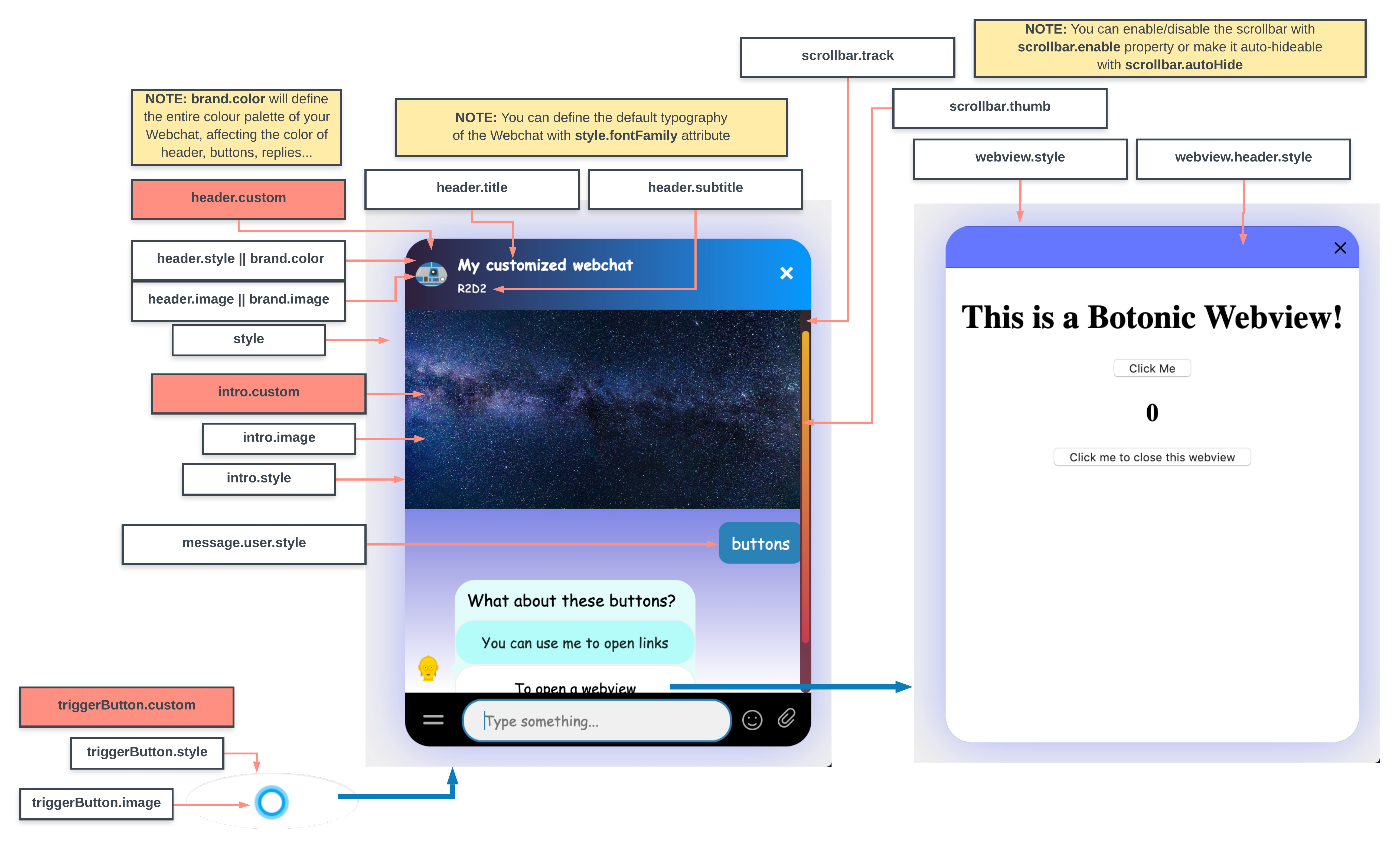
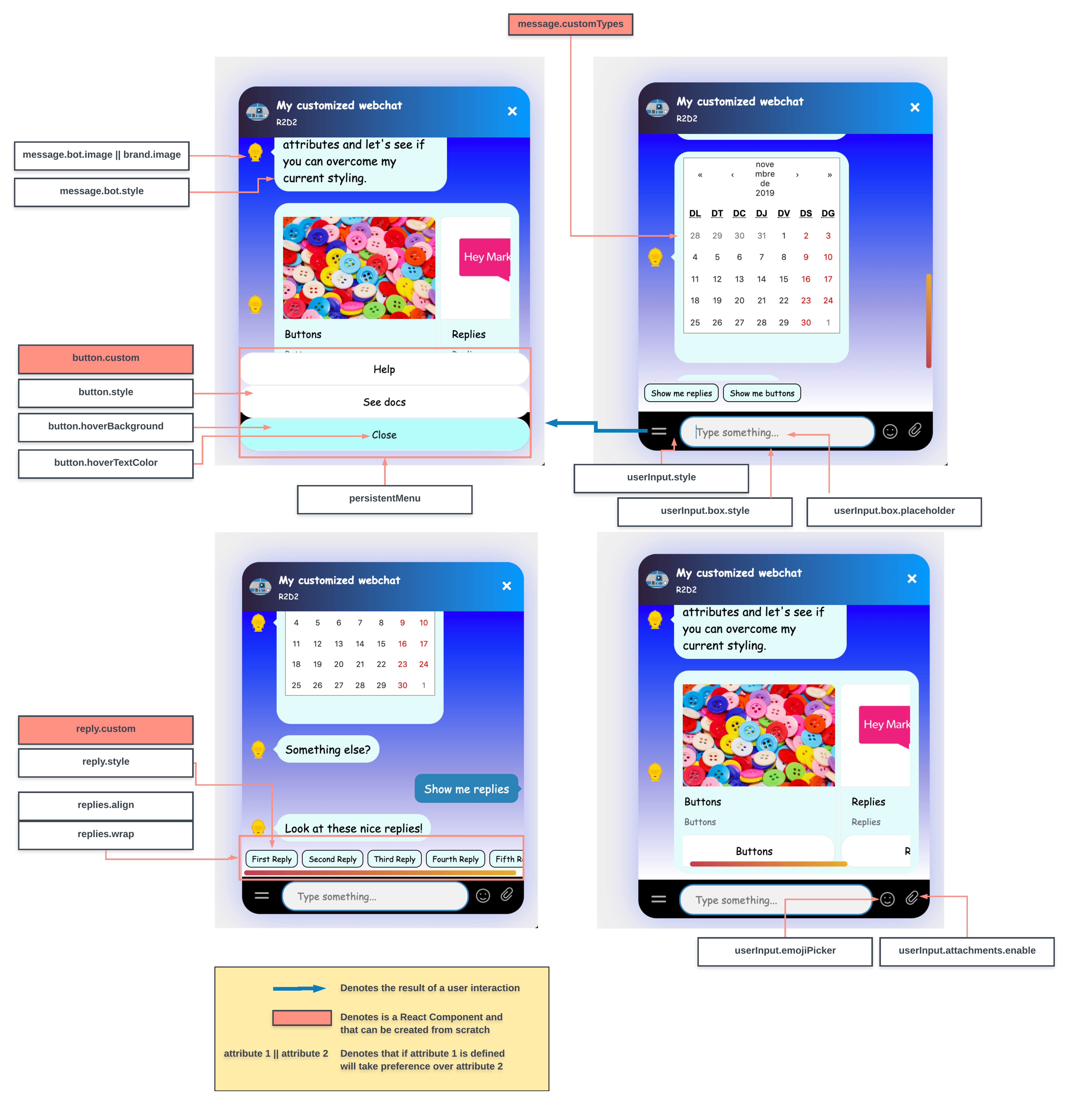
Take a look at the infographics below to know exactly what are the parts that are customized when changing the theme attributes.
Note: If you're using Hubtype Desk, add an alt property in your customMessage so that the text sent to the bot user is displayed to the agents in the Hubtype Desk platform.
E.g.: <MyCustomCalendarMessage alt="2019 Calendar" /> would display a calendar to the final user and the text "2019 calendar" to the agent.
It is also possible to customize the border and pointer of a conversation window (also called blobTick) as in this example:
- The border of the blobTick is displayed if the message border color is defined by using
borderColor. blobTickStylecan be used to set the position of the pointer.
message: {
 bot: {
  style: {
   border: '1px solid black',
   borderColor: 'black',
  },
  blobTickStyle: {
   alignItems: 'flex-end',
  },
 },
},
- You can define a top or bottom padding element to set an exact position.
blobTickStyle: {
 alignItems: 'flex-end',
 paddingBottom: '30px',
},
Note: You cannot use blobTick for blockInputs.
Custom Component
You can also create your own components from scratch.
| Property | Description |
|---|---|
customIntro | React component that is injected where introImage is displayed. It can also be defined in intro.custom. |
customTrigger | React component that is injected in the Launcher icon. It can also be defined in triggerButton.custom. |
customHeader | React Component that is injected in the Header of the widget. It can also be defined in header.custom. |
customReply | React Component that is injected in the Reply components of the widget. It can also be defined in reply.custom. |
customButton | React Component that is injected in the Button components of the widget. It can also be defined in button.custom. |
customSendButton | A fully customizable send button. It can also be defined in userInput.sendButton.custom. |
customMenuButton | A fully customizable button for trigger the persistent menu. It can also be defined in userInput.menuButton.custom. |
Note: Custom components redefine completely the components that are replacing, so the styles in conflicts with these components are overridden.
In this example, we are putting CSS styles into a custom 'quickreply'.
It's very important to put {props.children} inside the container, in this case the <div> tag:
src/webchat/custom-reply.js
import React from 'react'

export const CustomReply = props => (
  <div
    style={{
      color: '#0000ff',
      border: '2px solid #0000ff',
      backgroundColor: 'white',
      borderRadius: 30,
      padding: 8,
      cursor: 'pointer',
    }}
  >
    {props.children}
  </div>
)
This is an example of a custom Reply for our webchat. We can put all the fancy CSS styles we want.
This is a static object, so it's not applied in any component, so we don't have to put {props.children} inside any container.
src/webchat/custom-intro.js
import React from 'react'
import { staticAsset } from '@botonic/react'
import Img from '../assets/intro-image.jpg'

export const CustomIntro = () => (
  <img height={'50%'} width={'100%'} src={staticAsset(Img)} />
)
Note: When you define custom components that use static assets as shown in the example above, you must use the method staticAsset from @botonic/react in order to get it working properly in production environment.
src/webchat/index.js
import launcherIcon from '../assets/launcher-logo.png'
import IntroImage from '../assets/intro-image.jpg'
import C3POLogo from '../assets/c3po-logo.png'
import R2D2Logo from '../assets/r2d2-logo.png'
import CalendarMessage from './calendar-message'
import { CustomTrigger } from './custom-trigger'
import { CustomHeader } from './custom-header'
import { CustomIntro } from './custom-intro'
import { CustomReply } from './custom-reply'
import { CustomButton } from './custom-button'

export const webchat = {
  theme: {
    mobileBreakpoint: 460,
    style: {
      position: 'fixed',
      right: 20,
      bottom: 20,
      width: 400,
      height: 500,
      margin: 'auto',
      backgroundColor: 'white',
      borderRadius: 25,
      boxShadow: '0 0 50px rgba(0,0,255,.30)',
      overflow: 'hidden',
      backgroundImage:
        'linear-gradient(to top, #ffffff,#ffffff 11%,#9a9ae3 40%,#0000ff 85%,#0000ff 85%)',
      fontFamily: '"Comic Sans MS", cursive, sans-serif',
    },
    webview: {
      style: {
        top: 0,
        right: 0,
        height: 500,
        width: '100%',
      },
      header: {
        style: {
          background: '#6677FF',
        },
      },
    },

    brand: {
      // color: 'blue',
      image: R2D2Logo,
    },
    triggerButton: {
      image: launcherIcon,
      style: {
        width: '200px',
      },
      // custom: CustomTrigger,
    },
    intro: {
      // image: IntroImage,
      // style: {
      //   padding: 20
      // }
      custom: CustomIntro,
    },
    header: {
      title: 'My customized webchat',
      subtitle: 'R2D2',
      image: R2D2Logo,
      style: {
        height: 70,
      },
      // custom: CustomHeader
    },
    /*
     * brandImage will set both headerImage and botMessageImage with its current logo
     * you can overwrite these values by redefining them individually
     */
    message: {
      bot: {
        image: C3POLogo, // set it to 'null' to hide this image
        style: {
          border: 'none',
          color: 'black',
          borderRadius: '20px',
          background: '#e1fcfb',
        },
      },
      user: {
        style: {
          // border:'none',
          color: 'white',
          background: '#2b81b6',
          borderRadius: '10px',
        },
      },
      customTypes: [CalendarMessage],
    },

    button: {
      style: {
        color: 'black',
        background: 'white',
        borderRadius: 20,
      },
      hoverBackground: '#b3fcfa',
      hoverTextColor: 'black',

      // custom: CustomButton,
    },
    replies: {
      align: 'center',
      wrap: 'nowrap',
    },
    reply: {
      style: {
        color: 'black',
        background: '#e1fcfb',
        borderColor: 'black',
      },
      // custom: CustomReply,
    },
    userInput: {
      style: {
        background: 'black',
      },
      box: {
        style: {
          border: '2px solid #2b81b6',
          color: '#2b81b6',
          background: '#F0F0F0',
          width: '90%',
          borderRadius: 20,
          paddingLeft: 20,
          marginRight: 10,
        },
        placeholder: 'Type something...',
      },

      // enable: false,
      attachments: {
        enable: true,
      },

      emojiPicker: {
        enable: true
      },

      // These are the set of inputs which are not allowed.
      blockInputs: [
        {
          match: [/ugly/i, /bastard/i],
          message: 'We cannot tolerate these kind of words.',
        },
      ],
      persistentMenu: [
        { label: 'Help', payload: 'help' },
        {
          label: 'See docs',
          url: 'https://docs.botonic.io',
        },
        { closeLabel: 'Close' },
      ],
    },
    scrollbar: {
      // enable: false,
      autoHide: true,
      thumb: {
        opacity: 1,
        // color: 'yellow',
        bgcolor:
          'linear-gradient(-131deg,rgba(231, 176, 43) 0%,rgb(193, 62, 81) 100%);',
        border: '20px',
      },
      // track: {
      //   color: 'black',
      //   bgcolor:
      //     'linear-gradient(-131deg,rgba(50, 40, 43) 0%,rgb(125, 62, 81) 100%);',
      //   border: '20px',
      // },
    },
  },
All these changes can be tested using the botonic serve command (npm run start on Windows).
Example
Style Compliance
To avoid conflicts between bot styles and your host page, you can indicate if you want to enable the shadowDOM feature. This parameter must be defined in the webchat object in src/webchat/index.js:
export const webchat = {
  shadowDOM: true, // false by default
  theme: {...},
  ...
}
When set to true, Botonic renders the webchat inside a shadowDOM node so that the webchat styles are isolated from the rest of the host page.
export const webchat = {
  shadowDOM: true, // false by default
  hostId: 'myWebsiteRoot'
  theme: {...},
  ...
}
The hostId option allows you to define on which element the shadowRoot must be created, used along with the shadowDOM property. By default, "root" is used. If using root is not possible, another id must be used and passed with the new option.