Enabling and Disabling Buttons
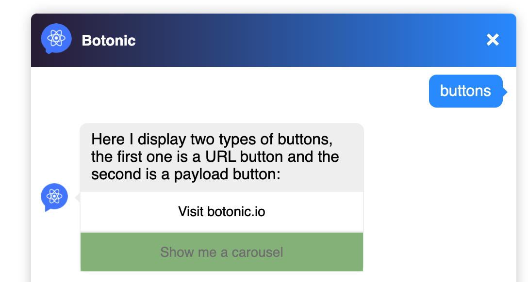
This functionality allows you to disable a button once the user has clicked on it. Thanks to this visual information, the user must follow a specific flow, which helps him to better understand the logical flow and navigate more easily.
Remember that:
- To add this property by default, you must set
autodisable: truein the webchatindex.js. - The button style can be customized thanks to the
disabledstyleproperty. - These properties can be applied to buttons that are embedded in a carousel.
- If you define the property in a specific component, the property defined in
index.jsis overwritten.
index.js
export const webchat = {
  theme: {
    style: {
      width: 500,
    },
    button: {
      disabledstyle: {
        opacity: 0.5,
        cursor: 'auto',
        pointerEvents: 'none',
        backgroundColor: 'green',
      },
      autodisable: true,
    },
  },
}
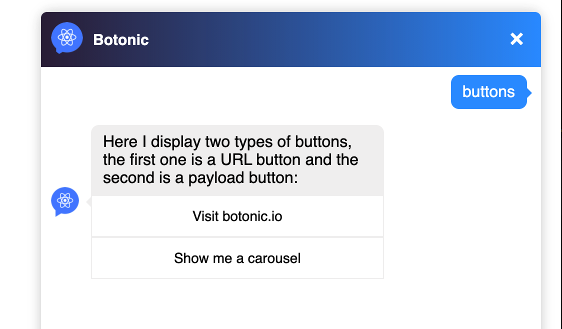
In button.js, if you add:
<Text>
    Here I display two types of buttons, the first one is a URL button and the second is a payload button:
     <Button payload='https://botonic.io' autodisable={false}>Visit botonic.io</Button>
     <Button payload='carousel'>Show me a carousel</Button>
</Text>
You should get something like: