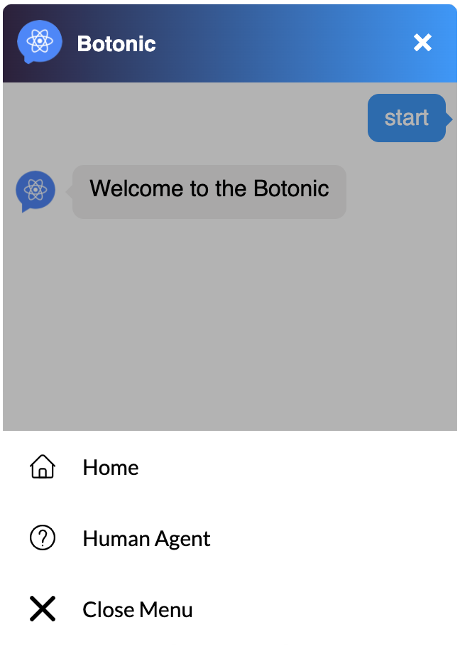
Persistent Menu
By adding the following lines of code in the webchat's object, you can enable a persistent menu. You can redefine the label for closing the persistent menu with closeLabel. Default text is 'Cancel'.
persistentMenu: [
  { label: "Home", payload: "hi" },
  { label: "Human Agent", payload: "help" },
  { closeLabel: "Close Menu" },
],
Example:
The persistent menu accepts the same properties as Botonic Buttons, e.g.: payload and url.
To darken the webchat in the background and focus on the persistent menu only, you can use a Dark Background. It can be defined under the properties theme.darkBackgroundMenu or theme.menu.darkBackground.
src/webchat/index.js
import { CustomPersistentMenu } from './custom-persistent-menu'
import { CustomMenuButton } from './custom-menu-button'

export const webchat = {
  theme: {
    userInput: {
      persistentMenu: [
        { label: 'Home', payload: 'hi' },
        { label: 'Human Agent', payload: 'help' },
        { closeLabel: 'Close Menu' },
      ],
      menu: {
        darkBackground: true,
        custom: CustomPersistentMenu,
      },
      menuButton: {
        custom: CustomMenuButton,
      },
    },
  },
}
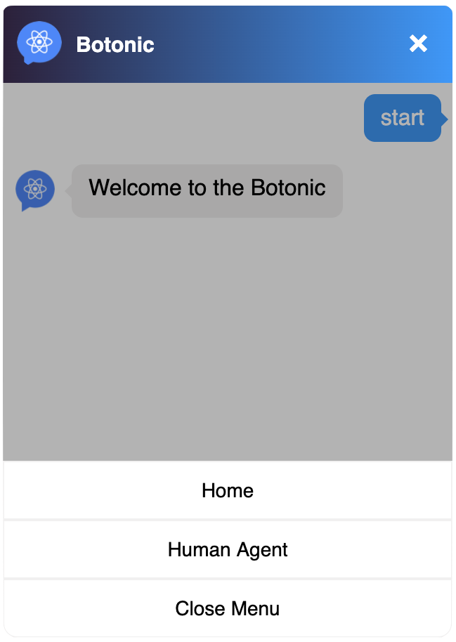
Button
You can customize the persistent menu button with the theme.customMenuButton or theme.userInput.menuButton.custom properties.
Example:
To do so:
- Add an image for the button in the Assets folder.
- Create a
custom-menu-button.jsfile. - Customize the button as shown in the example below.
src/webchat/custom-menu-button.js
import React from 'react'
import styled from 'styled-components'

export const IconContainer = styled.div`
  cursor: pointer;
  width: 56px;
  height: 48px;
  display: flex;
  align-items: center;
  justify-content: center;
`
export const Icon = styled.img`
  width: 18px;
`
export const CustomMenuButton = () => (
  <IconContainer>
    <Icon src={'https://image.flaticon.com/icons/svg/2948/2948037.svg'} />
  </IconContainer>
)
Menu
In order to have your entire persistent menu customized, first you will need to create a button for each of the options. To do so, you can create a component like this one:
src/webchat/custom-persistent-menu-button.js
import React, { useContext } from 'react'
import styled from 'styled-components'
import { WebchatContext } from '@botonic/react'
import { Icon, IconContainer } from './custom-menu-button'

const StyledButton = styled.div`
  cursor: pointer;
  height: 50px;
  width: 100%;
  background: white;
  display: flex;
  justify-content: left;
  align-items: center;
`

const Text = styled.p`
  @import url('https://fonts.googleapis.com/css?family=Lato:300,400,700');
  font-family: Lato;
  font-size: 15px;
  font-weight: 400;
  color: black;
  text-align: left;
`

export const CustomPersistentMenuButton = props => {
  const { sendInput } = useContext(WebchatContext)
  return (
    <StyledButton
      onClick={() => {
        props.payload
          ? sendInput({
              type: 'text',
              data: String(props.label),
              payload: props.payload,
            })
          : props.onClick()
      }}
    >
      <IconContainer>
        <Icon src={props.img} />
      </IconContainer>
      <Text
        style={{
          color: 'black',
        }}
      >
        {props.label}
      </Text>
    </StyledButton>
  )
}
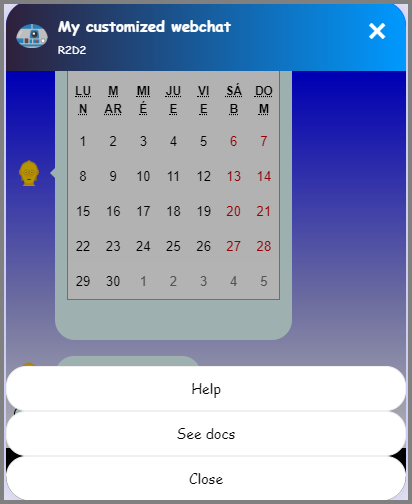
Then to customize the persistent menu, you must use the theme.userInput.menu.custom or theme.customPersistentMenu property.
To do so:
- Create a
custom-persistent-menu.jsfile. - Customize the menu as shown in the example below.
import React from 'react'
import styled from 'styled-components'
import { CustomPersistentMenuButton } from './custom-persistent-menu-button'

const ButtonsContainer = styled.div`
  width: 100%;
  bottom: 0;
  position: absolute;
  z-index: 2;
  text-align: center;
`

export const CustomPersistentMenu = ({ onClick, options }) => {
  return (
    <ButtonsContainer>
      <CustomPersistentMenuButton
        label={options[0].label}
        payload={options[0].payload}
        img={'https://image.flaticon.com/icons/svg/2948/2948025.svg'}
      />
      <CustomPersistentMenuButton
        label={options[1].label}
        payload={options[1].payload}
        img={'https://image.flaticon.com/icons/svg/2948/2948059.svg'}
      />
      <CustomPersistentMenuButton
        label={options[2].closeLabel}
        onClick={onClick}
        img={'https://image.flaticon.com/icons/svg/271/271203.svg'}
      />
    </ButtonsContainer>
  )
}
Example: