Carousel
Purpose
The Carousel component allows you to show a collection of images in a cyclic view. By displaying only a subset of images, the screen space is optimized. The navigation items, such as arrows, suggest additional content that is not currently visible, which encourages the user to continue exploring.
Properties
| Property | Type | Description | Required | Default value |
|---|---|---|---|---|
| children | Array of Element | Show text | Yes | - |
Element
The Element component is part of the carousel. It refers to each element of the carousel and contains a title, a subtitle, an image and a button.
| Property | Type | Description | Required | Default value |
|---|---|---|---|---|
| children | Botonic Components (Title, Subtitle, Pic, Button) | Define button elements | Yes | - |
Element Subcomponents
Title
The Title component is used to give a title to each carousel’s element.
| Property | Type | Description | Required | Default value |
|---|---|---|---|---|
| children | String | Show the title | Yes | - |
| style | String or number | Define the style of the title | No | font-size 14px |
Subtitle
The Subtitle component is used to add a description of each carousel’s element.
| Property | Type | Description | Required | Default value |
|---|---|---|---|---|
| children | String | Show the subtitle | No | - |
| style | String or number | Define the style of the subtitle | No | color: gray, font-size: 12px |
Pic
The Pic component is used in a carousel to better visualize the conversation and draw attention with the help of an image.
| Property | Type | Description | Required | Default value |
|---|---|---|---|---|
| src | URL | Show the image | Yes | - |
Example
To get this kind of carousel:
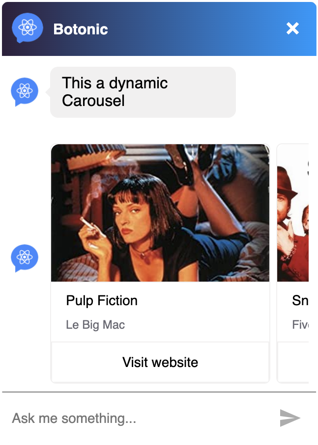
You can render it following the structure below:
import React from 'react'
import {
  Text,
  Button,
  Carousel,
  Pic,
  Element,
  Title,
  Subtitle,
} from '@botonic/react'

export default class extends React.Component {
  render() {
    let movies = [
      {
        name: 'Pulp Fiction',
        desc: 'Le Big Mac',
        url: 'https://www.imdb.com/title/tt0110912',
        pic:
          'https://images-na.ssl-images-amazon.com/images/I/51Z95XQDHRL._SY445_.jpg',
      },
      {
        name: 'The Big Lebowski',
        desc: 'Fuck it Dude',
        url: 'https://www.imdb.com/title/tt0118715',
        pic:
          'https://upload.wikimedia.org/wikipedia/en/a/a7/Snatch_ver4.jpg',
      },
      {
        name: 'Snatch',
        desc: 'Five minutes, Turkish',
        url: 'https://www.imdb.com/title/tt0208092',
        pic: 'http://www.libertytuga.pt/wp-content/uploads/2011/11/snatch.jpg',
      },
    ]
    return (
      <>
        <Text>This a dynamic Carousel</Text>
        <Carousel>
          {movies.map((e, i) => (
            <Element key={e.name}>
              <Pic src={e.pic} />
              <Title>{e.name}</Title>
              <Subtitle>{e.desc}</Subtitle>
              <Button url={e.url}>Visit website</Button>
            </Element>
          ))}
        </Carousel>
      </>
    )
  }
}
Customize or disable arrows on both sides of the carousel
You can disable or customize arrows displayed on the left and right sides of a carousel.
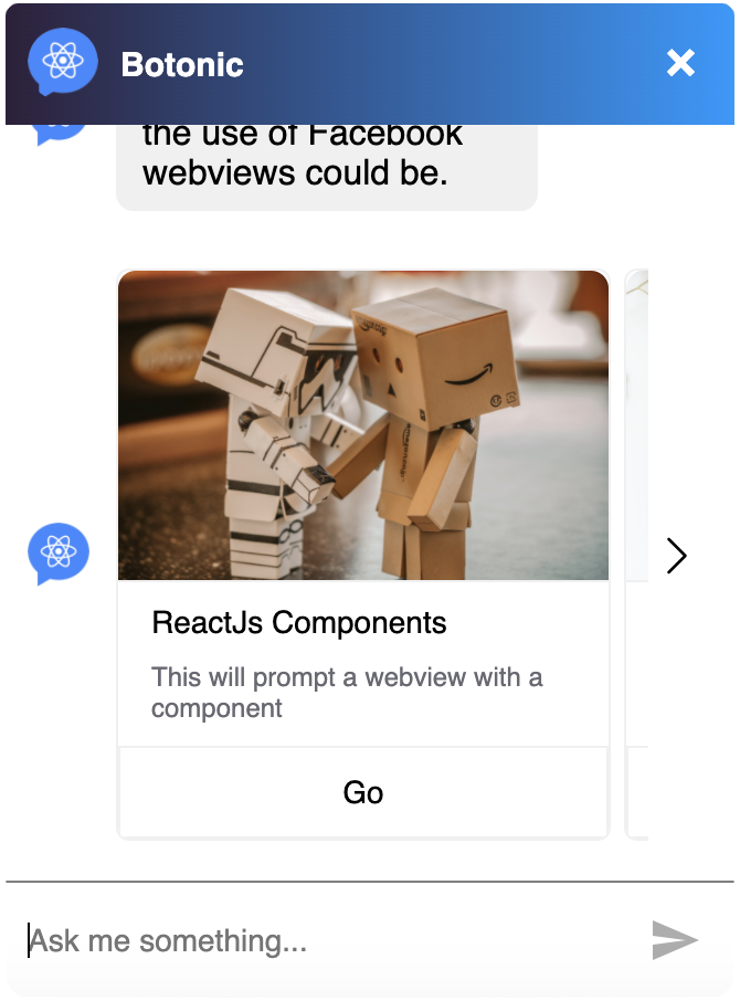
To do so:
- Add the following code in
src/webchat/index.js:
import {
  CustomCarouselLeftArrow,
  CustomCarouselRightArrow,
} from './custom-carousel-arrows'

export const webchat = {
  theme: {
    enableCarouselArrows: {true|false},
    customCarouselLeftArrow: CustomCarouselLeftArrow,
    customCarouselRightArrow: CustomCarouselRightArrow,
  },
}
- Add the following code in
src/webchat/custom-carousel-arrows.js:
import React from 'react'
import styled from 'styled-components'

const StyledArrowContainer = styled.div`
  position: absolute;
  box-sizing: border-box;
  top: 10px;
  height: calc(100% - 20px);
  width: 22px;
  background: white;
  display: flex;
  align-items: center;
  justify-content: center;
  cursor: pointer;
  left: ${(props) => props.left}px;
  right: ${(props) => props.right}px;


const StyledArrow = styled.img`
  width: 18px;
  height: 18px;
`

export const CustomCarouselLeftArrow = (props) => {
  return (
    <StyledArrowContainer left={0} onClick={() => props.scrollCarouselBy(-228)}>
      <StyledArrow
        src={'https://image.flaticon.com/icons/svg/860/860790.svg'}
      />
    </StyledArrowContainer>
  )
}

export const CustomCarouselRightArrow = (props) => {
  return (
    <StyledArrowContainer right={0} onClick={() => props.scrollCarouselBy(228)}>
      <StyledArrow
        src={'https://image.flaticon.com/icons/svg/860/860828.svg'}
      />
    </StyledArrowContainer>
  )
}
Note: scrollCarouselBy allows you to define the carousel's movement distance in pixels when clicking on the arrow.