Buttons
Purpose
The Button component is used to display a button during a conversation. The user can click on it and trigger specific actions instantly. It is very useful for audience interaction as it saves the user the time to manually enter text.
Properties
| Property | Type | Description | Required | Default value |
|---|---|---|---|---|
| webview | Object | Open a webview when the button is clicked | No | - |
| params | String | Parameters passed to the webview | No | - |
| path | String | No | - | |
| children | String | Show the button | Yes | - |
| payload | String, Number | Call to action | No | - |
| url | String | This URL is opened in a mobile browser when the button is clicked | No | - |
| onClick | String | Set the action | No | - |
| target | String | Opens the linked page in a new window (_blank) or same frame (_self) or parent frame (_parent) or full body of the window (_top) or framename | No | _blank |
| autodisable | Boolean | Disable a button once the user has clicked on it | No | false |
| disabledstyle | String | Visual appearance of the button once it is disabled | No | - |
Note: Webview, payload and url are not strictly required. However, if children is set, one of the three properties must be defined as follows:
<Button payload="1">1</Button>
<Button webview={MyWebview}>1</Button>
<Button url='https://botonic.io' target={'blank'|'_self'|'_parent'|'_top'|'framename'}>Botonic</Button>
But never
<Button>Content</Button>
Example
Output
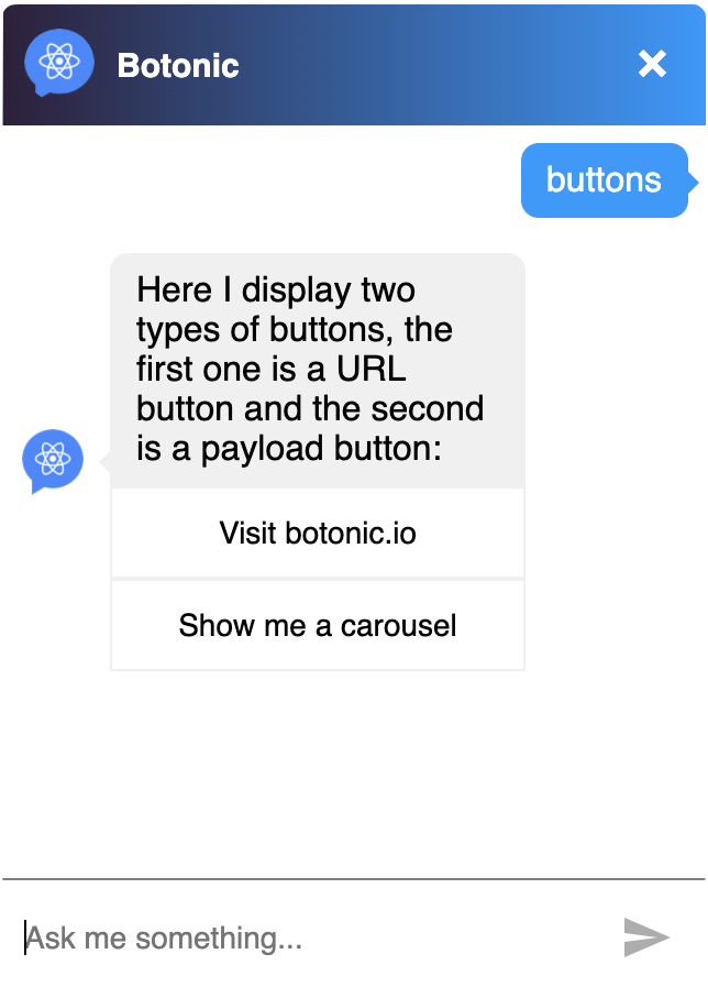
<Text>
  Here I display two types of buttons, the first one is a URL button and the
  second is a payload button:
  <Button url='https://botonic.io'>Visit botonic.io</Button>
  <Button payload='carousel'>Show me a carousel</Button>
</Text>